


Our name
The FourLeaf name is bold and truly unique in the credit union industry. So what’s the meaning behind it? It honors our heritage and also symbolizes prosperity, innovation, purpose, and an ongoing connection to our members and communities. FourLeaf reflects the modern, forward-thinking brand that we are. It’s inspired by where we’re going, without forgetting where we’ve been.
Did you know that we’ve been around since 1941? From Grumman, to Bethpage, to FourLeaf. Learn all about our history and evolution as a credit union here.

Our logo
Our logo reflects our future – the subtle infinity symbol representing infinite possibilities for all of us – today, tomorrow, and always. Our colors are steeped in history. With our primary orange color, we pay homage to our recent history as Bethpage. Together with our rich, deep blue, the colors reflect our core membership in New York.
Our tagline
From applying for a credit card to closing on your mortgage to opening your child’s first savings account, FourLeaf is here to help you reach your financial goals. As a credit union, we’re about making banking accessible, and our tagline, “Let’s Money Together,” reflects that. It lets members know that their next financial decision doesn’t have to be so intimidating; we’re in this together. Let’s Money Together also symbolizes our deep connection to the communities we serve and our commitment to positively impact them through partnerships, volunteering, and charitable giving.

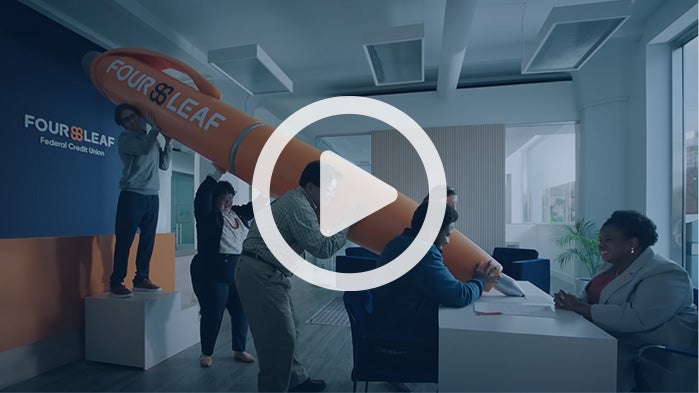
All eyes on our latest campaign!
Life is full of big deals – both literally and figuratively. Buying a house is a BIG deal! Planning for retirement is a BIG deal! But knowing you have a network of supportive, knowledgeable people behind you makes those big deals a lot less scary. That’s what our latest campaign is all about – life’s big moments and how FourLeaf is there for you as a trusted financial partner for the important decisions that ensue.

Learn about our recent rebrand from Bethpage to FourLeaf here.